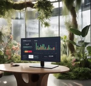
As digital work environments become more immersive and omnipresent, design strategies that prioritize human well-being are gaining traction. One such strategy is biophilic design—a concept rooted in the idea that humans have an innate connection to nature. While biophilic design has traditionally shaped physical architecture and interior spaces, its principles are now being adapted to digital interfaces, including the often-overlooked realm of CRM dashboards.
Customer Relationship Management (CRM) tools are where salespeople, marketers, and support teams spend a large portion of their day. These dashboards are typically built for utility, but rarely for comfort, mental clarity, or cognitive ease. By integrating biophilic design, CRM platforms can become more than just tools—they can become environments that promote focus, calm, and even joy.
What Is Biophilic Design?
Biophilic design incorporates elements of the natural world into human-made environments. In physical spaces, this might include natural lighting, plants, water features, and organic materials. In digital design, biophilia manifests through natural imagery, organic patterns, soft color palettes, and interface rhythms that mimic nature’s pace.
Applied thoughtfully, these elements reduce stress, improve mood, and enhance productivity—benefits that can translate directly into higher-quality customer interactions and better decision-making within a CRM system.
Bringing Biophilia into CRM Dashboards
Here are several ways to incorporate biophilic principles into CRM dashboard design:
1. Nature-Inspired Color Palettes
Swap sterile grayscale or aggressive red-alert tones for earth tones, soft blues, forest greens, and warm neutrals. These colors evoke calm and improve readability, making daily CRM use less fatiguing.
2. Natural Light Simulation
Interface themes can dynamically adjust to mimic circadian lighting—lighter tones in the morning, warmer hues in the evening—mirroring the natural progression of daylight. This can support energy levels and reduce screen fatigue.
3. Organic Layouts and Flow
Rather than rigid, grid-heavy interfaces, CRM dashboards can incorporate fluid layouts with rounded corners, generous white space, and microanimations that simulate natural movement, like the flow of water or the sway of leaves.
4. Natural Textures and Backgrounds
Subtle background textures resembling paper, wood grain, or stone can create a sense of tactility. Even light use of background nature imagery, like forests or clouds, can offer mental micro-rests during intense work.
5. Soundscapes and Ambient Feedback
While optional, soft ambient nature sounds or gentle audio cues—like a soft chime or birdsong—can enhance the user experience, especially during task transitions or completion milestones.
Why It Matters
Traditional CRM interfaces often prioritize dense data and productivity over user well-being. But studies have shown that environments incorporating natural elements can increase focus, reduce errors, and support creative problem-solving. For customer-facing teams, a more emotionally balanced dashboard can result in more empathetic and effective communication.
Moreover, as hybrid and remote work becomes the norm, digital environments are the new “office spaces.” Applying biophilic design principles to these spaces acknowledges the emotional and cognitive needs of users.
Conclusion
Biophilic design isn’t about turning your CRM into a digital rainforest—it’s about subtle, intentional design choices that align technology with the rhythms of human nature. By integrating these principles, CRM dashboards can evolve into not just smarter tools, but healthier and more humane digital workspaces. As a result, businesses not only benefit from improved user satisfaction, but also from teams who are more engaged, focused, and inspired.